Multi-panel figures in matplotlib#
# initialization
import numpy as np
import pandas as pd
import matplotlib.pyplot as plt
Multi-panel figure via multiple .add_subplot() calls#
Sometimes, your data visualizations may include multiple plots that are related to each other (e.g., sharing a common x-axis). Instead of treating these plots as separate, it may be useful to construct them as panels of the same figure.
You have already seen one example figure of this form, namely the 3-panel histogram from week 4. We’ll now discuss how this plot is actually created in matplotlib.
Again, the data that we’ll be using is:
heights_1 = np.array([
    177, 169, 182, 173, 171, 179, 179, 171, 175, 163,
    180, 179, 179, 164, 173, 175, 177, 176, 181, 167,
    173, 171, 175, 177, 181, 172, 178, 165, 174, 180,
    173, 176, 180, 180, 179, 174, 175, 173, 179, 186,
    175, 172, 175, 164, 176, 170, 174, 175, 178, 176
])

heights_2 = np.array([
    181, 163, 163, 174, 170, 173, 177, 174, 179, 187,
    167, 174, 177, 173, 183, 155, 191, 165, 176, 180,
    168, 178, 180, 179, 167, 191, 176, 165, 180, 175,
    178, 146, 185, 176, 176, 171, 181, 182, 177, 186,
    175, 171, 166, 170, 181, 174, 172, 179, 166, 170
])

heights_3 = np.array([
    166, 167, 167, 166, 167, 171, 161, 162, 171, 158,
    169, 156, 162, 168, 163, 164, 168, 155, 165, 166,
    163, 161, 161, 167, 156, 166, 162, 163, 168, 168,
    166, 165, 169, 174, 168, 160, 154, 174, 156, 171,
    168, 163, 168, 160, 170, 162, 168, 169, 164, 176
])
To create multiple panels in a figure, all we have to do is to issue multiple .add_subplot() call. However, to control the layout of the figure, we will need to supply the first three positional arguments (nrow, ncol and index) to .add_subplot(). Note that index is a single integer that determines both the row and column location. In particular, the index of the panel increases first with columns and then with rows.
In our specific case, we will create 3 Axes instances like so:
fig = plt.figure()
ax1 = fig.add_subplot(3, 1, 1)
ax2 = fig.add_subplot(3, 1, 2)
ax3 = fig.add_subplot(3, 1, 3)

plt.show(fig)
Now we add content to each Axes instances the same way we add content to a single panel plot:
bins = np.arange(146.5, 192, 1)

fig = plt.figure()
ax1 = fig.add_subplot(3, 1, 1)
ax2 = fig.add_subplot(3, 1, 2)
ax3 = fig.add_subplot(3, 1, 3)

ax1.hist(heights_1, bins=bins, color="tab:blue")
ax1.set_title("Group 1")

ax2.hist(heights_2, bins=bins, color="tab:orange")
ax2.set_title("Group 2")

ax3.hist(heights_3, bins=bins, color="tab:green")
ax3.set_title("Group 3")

plt.show(fig)
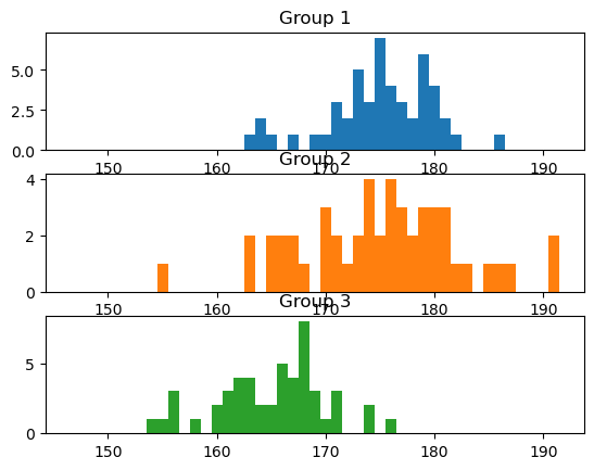
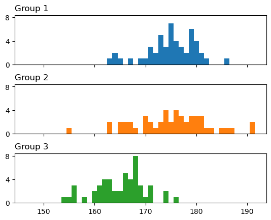
At first glance, the figure above seems to indicate that there are more individuals in group 2 than groups 1 and 3. But upon closer inspection, this is really because each of the 3 panels use a separate y-axis scale. To force common axes, we use the sharey argument to link the y-axis scales of two panels when create the subplots (we also added sharex, even though it is not strictly necessary in this case):
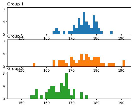
bins = np.arange(146.5, 192, 1)
fig = plt.figure()
ax1 = fig.add_subplot(3, 1, 1)
ax2 = fig.add_subplot(3, 1, 2, sharex=ax1, sharey=ax1)
ax3 = fig.add_subplot(3, 1, 3, sharex=ax1, sharey=ax1)

ax1.hist(heights_1, bins=bins, color="tab:blue")
ax1.set_title("Group 1", loc="left")
ax1.set_yticks([0, 4, 8])

ax2.hist(heights_2, bins=bins, color="tab:orange")
ax2.set_title("Group 2", loc="left")

ax3.hist(heights_3, bins=bins, color="tab:green")
ax3.set_title("Group 3", loc="left")

plt.show(fig)
Next, we want to expand the space between plots to make the group labels clearer. We also want to eliminate the redundant x-axis labels on the top two plots. The former can be achieved by a Fig.subplots_adjust() call with an hspace argument, and the latter can be achieved using the labelbottom argument of the tick_params() call of the respective Axes instances:
fig = plt.figure()
ax1 = fig.add_subplot(3, 1, 1)
ax2 = fig.add_subplot(3, 1, 2, sharex=ax1, sharey=ax1)
ax3 = fig.add_subplot(3, 1, 3, sharex=ax1, sharey=ax1)
fig.subplots_adjust(hspace=0.4)

ax1.hist(heights_1, bins=bins, color="tab:blue")
ax1.set_title("Group 1", loc="left")
ax1.tick_params(labelbottom=False)
ax1.set_yticks([0, 4, 8])

ax2.hist(heights_2, bins=bins, color="tab:orange")
ax2.tick_params(labelbottom=False)
ax2.set_title("Group 2", loc="left")

ax3.hist(heights_3, bins=bins, color="tab:green")
ax3.set_title("Group 3", loc="left")

plt.show(fig)
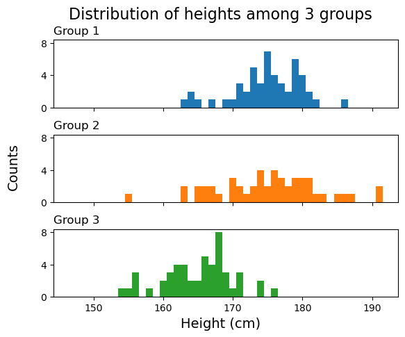
Finally, we can add the overall x-axis label, the overall y-axis label, and the figure title using .supxlabel(), .supylabel(), and .suptitle() method of the Figure instance, respectively:
fig = plt.figure()
ax1 = fig.add_subplot(3, 1, 1)
ax2 = fig.add_subplot(3, 1, 2, sharex=ax1, sharey=ax1)
ax3 = fig.add_subplot(3, 1, 3, sharex=ax1, sharey=ax1)
fig.subplots_adjust(hspace=0.4)

ax1.hist(heights_1, bins=bins, color="tab:blue")
ax1.set_title("Group 1", loc="left")
ax1.tick_params(labelbottom=False)
ax1.set_yticks([0, 4, 8])

ax2.hist(heights_2, bins=bins, color="tab:orange")
ax2.tick_params(labelbottom=False)
ax2.set_title("Group 2", loc="left")

ax3.hist(heights_3, bins=bins, color="tab:green")
ax3.set_title("Group 3", loc="left")

fig.supxlabel("Height (cm)", fontsize=14)
fig.supylabel("Counts", fontsize=14)
fig.suptitle("Distribution of heights among 3 groups", fontsize=16)

plt.show(fig)