
Linear regression#
# initialization
import numpy as np
import pandas as pd
import matplotlib.pyplot as plt
Conceptual foundations of linear regression#
Often times we are interested in how one variable depends on another. The simplest dependence of such kind is a linear relationship. However, because of measurement uncertainty and inherit variation in the variables not captured by the dependency being studied, when we plot the data in (e.g.) a scatter plot, they seldom fall onto a literal straight line.
As an example, suppose we measured the heights (in cm) and weights (in kg) of a number of male American adults, we may obtain a dataset like the following:
heights = np.array([
    160, 165, 164, 164, 171, 170, 156, 161, 164, 153
])

weights = np.array([
    66.8, 93.0, 94.7, 81.9, 101.8, 113.6, 53.3, 64.7, 83.5, 61.1
])
When we plot the heights against the weights, we get the following:
fig = plt.figure()
ax = fig.add_subplot()

ax.scatter(heights, weights)
ax.set_xlabel("Height (cm)", fontsize=14)
ax.set_ylabel("Weight (kg)", fontsize=14)

plt.show(fig)
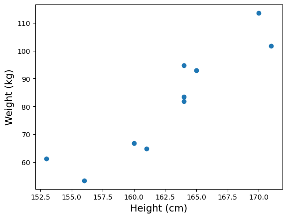
Notice that while the measurements don’t fall onto a literal straight line, there is a clear linear trend. So we may still want to associate the data with a “best fitted line”. But how do we do that?
A common strategy in such situation is to find a straight line of the form \(y = m x + c\) with slope \(m\) and intercept \(c\) that minimizes sum of the square errors \(\sum_i \left( y_i - (m x_i + c) \right)^2\) (here \((x_i, y_i)\) are the individual data points). The procedure to do so is known as linear regression.
As it turns out, the linear regression procedure outlined above corresponds to a particular model of the relationship between \(x\) and \(y\). The model is:
At any given value of \(x\), the variable \(y\) is distributed as a Gaussian (a.k.a. normal) distribution with mean \(m x + c\) and standard deviation \(\sigma\), where \(\sigma\) is the same across all values of \(x\)
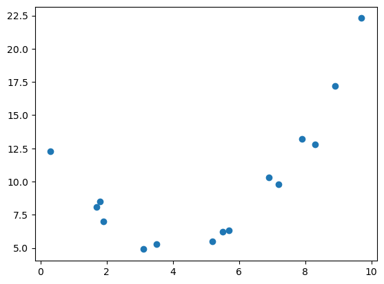
In applying linear regression, it is important to check that the model assumption is plausible. For example, while there are clear relationship between \(x\) and \(y\) below, a linear regression will not be appropriate.
x = np.array([
    5.2, 5.7, 0.3, 1.7, 6.9, 8.3, 3.1, 8.9, 7.2, 1.9,
    5.5, 3.5, 1.8, 7.9, 9.7
])

y = np.array([
    5.5, 6.3, 12.3, 8.1, 10.3, 12.8, 4.9, 17.2, 9.8, 7.0,
    6.2, 5.3, 8.5, 13.2, 22.3
])
fig = plt.figure()
ax = fig.add_subplot()

ax.scatter(x, y)

plt.show(fig)
Linear regression in python#
In python, linear regression is implemented by the linregress() function in the scipy.stats submodule of the third-party python module scipy (Broadly speaking, scipy is a collection of tools for scientific computing and numerical calculations, and is built on top of numpy).
Since we’ll use only this specific function from the scipy.stats, we will import it directly as:
from scipy.stats import linregress
Now, when we apply linregress() on the height and weight data above, we obtain:
wt_h = linregress(heights, weights)
print(wt_h)
LinregressResult(slope=3.2126420454545452, intercept=-441.57812500000006, rvalue=0.9161407489976452, pvalue=0.00019534135276194468, stderr=0.4969862092877473, intercept_stderr=80.95232605206309)
The slope and intercept attributes of wt_h has the meaning you’d expect. In other words, we found that the best fit line between heights (in cm) and weights (in kg) to be:
weight = 3.21 * height − 442
To draw the best fitted line on the plot we already have, we need to generate a new data series using the slope and intercept. For our example,
# generate new data based on the best fitted line
height_fit = np.array([ np.min(heights), np.max(heights) ])
weight_fit = wt_h.slope * height_fit + wt_h.intercept

# make a plot

fig = plt.figure()
ax = fig.add_subplot()

# plot the actual data
ax.scatter(heights, weights, label="data")

# plot the best fitted line
ax.plot(height_fit, weight_fit, color="red", linestyle="--", label="best fit")

ax.set_xlabel("Height (cm)", fontsize=14)
ax.set_ylabel("Weight (kg)", fontsize=14)

ax.legend()

plt.show(fig)
Correlation coefficient \(r\)#
The third value returned by linregress() is the Pearson’s correlation coefficient \(r\). It is a dimensionless number that tells us how strongly the two variables are related to each other. (We’ll ignore the rest of the values return by linregress(), since these values are associated with inferential statistics and require more sophistication to interpret).
Mathematically, the Pearson’s correlation coefficient is defined as:
In general, \(r\) can takes any value between −1 and 1. If the association between \(x\) and \(y\) is negative (i.e., when the regression slope is negative), \(r\) will be negative. Conversely, if the association is positive (positive slope), \(r\) will be positive. Furthermore, the closer the value of \(|r|\) is to 1, the stronger is the association.
The figure below illustrates various data with different level of correlation (you can download the data behind the plot here):
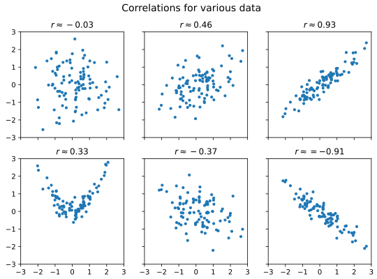
As a rule of thumb, we may call correlation with \(|r| < 0.3\) weak, \(|r| > 0.7\) strong, and values in-between moderate. However, do note that correlation is not causation.
In the case of the height versus weight example, we have:
wt_h.rvalue
0.9161407489976452
As \(r \approx 0.9\), there is a strong and positive association between height and weight.
Coefficient of determination \(R^2\)#
In the specific case of linear regression, the square of \(r\) also has a nice interpretation. Recall that the (sample) variance of a variable \(y\) is defined as:
Thus, let \(\hat{y}_i = m x_i + c\) be the predicted value of \(y_i\) based on the linear regression. We may say that the variance explained by the regression is:
Similarly, we may define the residual variance to be:
We may then define the portion of variance explained to be:
where the derivation (the \(= \ldots =\) part) rely on the fact that \(m\) and \(c\) are obtained from least square procedure. In this context, \(R^2\) is known as the coefficient of determination.
For the specific case of linear regression, it turns out that \(r^2 = R^2\). Thus, the square of rvalue can also be interpreted as the proportion of variance explained by the linear regression.
In the case of our height versus weight data, we have:
wt_h.rvalue**2
0.8393138719739663
Thus, about 84% of the weight variation is explained by the height variation.
Linear regression on time series in python#
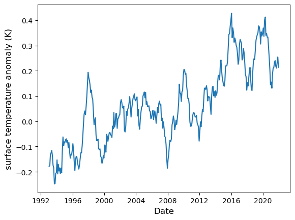
Using linregress() on time series in python presents a particular challenge because of the technicality of datetime representations in python. As an example, let’s consider the time series of ocean surface temperature anomaly. The data comes from Copernicus Marine Service’s Global Ocean Sea Surface Temperature time series. We convert this data into a csv format, which you can download from here.
To start, we load the csv file into a pandas DataFrame:
surf_temp = pd.read_csv("data/ocean_surface_temp_1993-2021.csv", parse_dates = ["time"])
surf_temp.info()
<class 'pandas.core.frame.DataFrame'>
RangeIndex: 348 entries, 0 to 347
Data columns (total 2 columns):
 #   Column       Non-Null Count  Dtype
---  ------       --------------  -----
 0   time         348 non-null    datetime64[ns]
 1   sst_anomaly  348 non-null    float64
dtypes: datetime64[ns](1), float64(1)
memory usage: 5.6 KB
Here is how the data look like in a plot:
fig = plt.figure()
ax = fig.add_subplot()

ax.plot(surf_temp["time"], surf_temp["sst_anomaly"])
ax.set_xlabel("Date", fontsize=12)
ax.set_ylabel("surface temperature anomaly (K)", fontsize=12)

plt.show(fig)
If we attempt to perform a linear regression as-is, we’ll get an error:
linregress(surf_temp["time"].values, surf_temp["sst_anomaly"].values)
---------------------------------------------------------------------------
DTypePromotionError                       Traceback (most recent call last)
Cell In[13], line 1
----> 1 linregress(surf_temp["time"].values, surf_temp["sst_anomaly"].values)

File ~\miniforge3\envs\learn\Lib\site-packages\scipy\stats\_axis_nan_policy.py:543, in _axis_nan_policy_factory.<locals>.axis_nan_policy_decorator.<locals>.axis_nan_policy_wrapper(***failed resolving arguments***)
    540     samples = [sample.reshape(new_shape)
    541                for sample, new_shape in zip(samples, new_shapes)]
    542 axis = -1  # work over the last axis
--> 543 NaN = _get_nan(*samples) if samples else np.nan
    545 # if axis is not needed, just handle nan_policy and return
    546 ndims = np.array([sample.ndim for sample in samples])

File ~\miniforge3\envs\learn\Lib\site-packages\scipy\_lib\_util.py:1023, in _get_nan(shape, xp, *data)
   1021 xp = array_namespace(*data) if xp is None else xp
   1022 # Get NaN of appropriate dtype for data
-> 1023 dtype = xp_result_type(*data, force_floating=True, xp=xp)
   1024 device = xp_result_device(*data)
   1025 res = xp.full(shape, xp.nan, dtype=dtype, device=device)

File ~\miniforge3\envs\learn\Lib\site-packages\scipy\_lib\_array_api.py:533, in xp_result_type(force_floating, xp, *args)
    529 if is_numpy(xp) and xp.__version__ < '2.0':
    530     # Follow NEP 50 promotion rules anyway
    531     args_not_none = [arg.dtype if getattr(arg, 'size', 0) == 1 else arg
    532                      for arg in args_not_none]
--> 533     return xp.result_type(*args_not_none)
    535 try:  # follow library's preferred promotion rules
    536     return xp.result_type(*args_not_none)

DTypePromotionError: The DType <class 'numpy.dtypes.DateTime64DType'> could not be promoted by <class 'numpy.dtypes.Float64DType'>. This means that no common DType exists for the given inputs. For example they cannot be stored in a single array unless the dtype is `object`. The full list of DTypes is: (<class 'numpy.dtypes.DateTime64DType'>, <class 'numpy.dtypes.Float64DType'>, <class 'numpy._FloatAbstractDType'>)
To perform linear regression on time series, we need to transform the x coordinates into pure numbers. One way to do so is to define:
surf_time_diff = surf_temp["time"].values - surf_temp["time"].values[0]
surf_days =  surf_time_diff / np.timedelta64(1, 'D')
In the above code, surf_temp["time"].values is a numpy array of timestamps. By subtracting the timestamps with an initial time surf_temp["time"].values[0], we obtain an array of time differences surf_time_diff. Then, to create an array of pure number, we divide the array of time differences with a time difference scalar, which we create using np.timedelta64(1, 'D') (corresponding to the time difference of 1 day). The result is the array surf_days, which are pure numbers with implicit unit of days.
Now we can use surf_days as the first argument and perform the linear regression:
regress = linregress(surf_days, surf_temp["sst_anomaly"].values)
print(regress)
LinregressResult(slope=4.077876288011608e-05, intercept=-0.15074916268568736, rvalue=0.8199546245386795, pvalue=7.749079818618169e-86, stderr=1.5304792390944346e-06, intercept_stderr=0.009337971552794588)
We note that the slope now has an implicit unit of K/day.
Next, to generate the regression line, we start with two time points, transform these into pure numbers, then use the regression equation to find the corresponding fitted temperature anomaly:
date_range = pd.Series([surf_temp["time"].min(), surf_temp["time"].max()])
day_range = (date_range - surf_temp["time"].values[0]) / np.timedelta64(1, 'D')
temp_range = day_range * regress.slope + regress.intercept
fig = plt.figure()
ax = fig.add_subplot()

ax.plot(surf_temp["time"], surf_temp["sst_anomaly"], label="data")
ax.plot(date_range, temp_range, ls="--", label="best-fitted line")

ax.set_xlabel("Date", fontsize=12)
ax.set_ylabel("surface temperature anomaly (K)", fontsize=12)

ax.legend()

plt.show(fig)
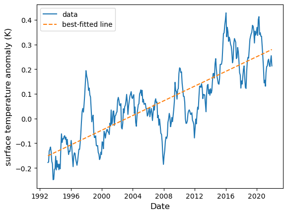
Now, we note that the regression slope is small as a number. It is more natural to represent the rate in per-year denominator. To do so we multiply the regression slope with the number of days in a year (which, on average, is 365.2425). From this we obtain:
slope_year = regress.slope * 365.2425
print(slope_year)
0.014894137301240798
Thus the rate of ocean temperature increase is approximately 0.015 K per year.
One final remark: because correlation is dimensionless, the transformation we perform has no effect on its value. Thus, the correlation between temperature anomaly with date is simply:
print(regress.rvalue)
0.8199546245386795